Journal · Using color 01
The color ratio that makes dusty pink look refined
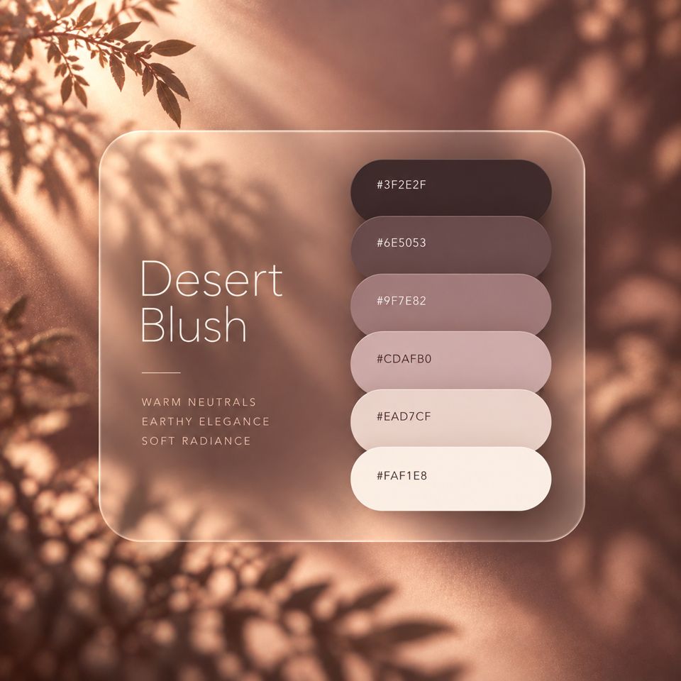
When dusty pink looks cheap, the colors themselves are rarely the problem. It comes down to which color you use, and over how much of the space. Adjust that balance, and the same six colors look far more refined.
Start with 70 / 20 / 10
A common idea in color design is to split the space into 70 percent base, 20 percent main and 10 percent accent. It isn't a strict rule, but it is a good place to start when you're unsure.
Use the base for backgrounds and empty space, the main color for text and headings, and the accent for links and small details.
The key is to use the pinkest color on purpose in small amounts. The smaller its area, the more it stands out as an accent, and the calmer the whole screen looks.
Trying it with Desert Blush
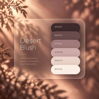
Here is how the six colors of Desert Blush fit into that balance.
For body text, use the darkest color, #3F2E2F. It isn't pure black but a deep brown with a hint of pink, so it sits naturally on the pink background and is still easy to read.
The accent #9F7E82 has a contrast ratio of 3.3:1 against the background. Under the web accessibility guidelines (WCAG), that is enough for large text but not for body text. For buttons with text on them, it is safer to use the darker #6E5053 as the background with #FAF1E8 text. That pair reaches 6.4:1 and meets the guideline even for small text.
Common mistakes and how to fix them
Spring collection
Soft colors of spring.
Take a lookSpring collection
Soft colors of spring.
Take a look- Using a middle tone over too much space. A middle pink like #CDAFB0 as the background makes the whole screen feel sweet and heavy. Go back to the lightest color, #FAF1E8, for the background, and keep the middle tones for lines and small areas.
- Too little difference between pinks. Placing #CDAFB0 on #EAD7CF makes it hard to see where one area ends and the next begins. Keep neighboring colors at least two steps apart in brightness, and put #3F2E2F text on #EAD7CF areas (9.2:1).
In short
To make dusty pink look refined, use the lightest color widely, the darkest color for text, and the pinkest color only a little. Getting the balance of areas right changes the result far more than adding more colors.
Try it
Open the Desert Blush page and tap each of the six colors. The whole page switches colors, so you can see how today's balance actually looks.
Reference: Understanding Success Criterion 1.4.3: Contrast (Minimum) (W3C). Contrast ratios are calculated with the WCAG 2.2 formula.