Journal · Using color 04
Autumn-leaf colors without the clutter
The reds and oranges of autumn leaves feel like the season on their own. But when several vivid colors cover large areas, the screen never settles. Just choosing one star color brings the same six colors together.
Pick just one star color
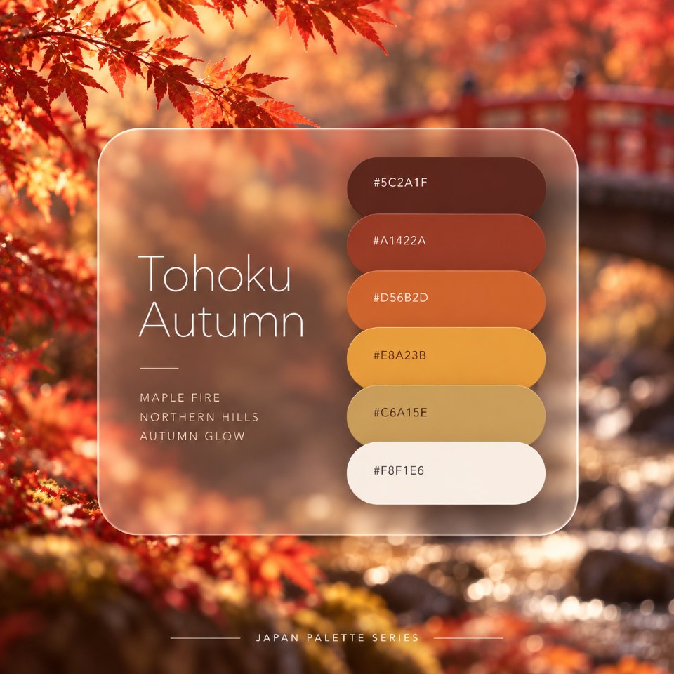
Tohoku Autumn has two vivid colors: the orange of autumn leaves, #D56B2D, and a ginkgo-like yellow, #E8A23B. Both are beautiful, but when you use both over large areas, they compete for attention and the screen gets too busy.
The more you want an autumn feel, the more it helps to choose a single star color. Here the orange takes the lead, and the yellow stays as small touches.
Pale cream for large areas, deep brown for text, and orange for just 10 percent. The yellow goes into even smaller touches within that 10 percent.
Roles for Tohoku Autumn
Here are the roles of the six colors with the lightest, #F8F1E6, as the background.
For body text, use the darkest color, #5C2A1F. It reaches 10.4:1 against the background and stays easy to read even at small sizes. For buttons, use #A1422A as the background with #F8F1E6 text. That pair reaches 5.6:1 and meets the 4.5:1 web accessibility guideline (WCAG).
The star orange, #D56B2D, is 3.1:1. That works for large headings but not for body text. The yellow #E8A23B and the muted gold #C6A15E fall below 3:1, so use them only for areas and lines, never for text.
Common mistakes and how to fix them
Autumn collection
The reddest day in the hills.
Take a lookAutumn collection
The reddest day in the hills.
Take a look- Using both vivid colors over large areas. When orange and yellow both fill large areas, it's unclear which one leads. Let one be the star and keep the other to small touches.
- Putting whitish text on a bright color. #F8F1E6 on #E8A23B is only 1.9:1 and barely readable. For text on a yellow area, use #5C2A1F (5.4:1).
One more palette for autumn
Adding a little color from another palette changes the mood. A touch of moss green makes it calmer, and a touch of deep purple makes it feel like autumn leaves at night.
In short
To use autumn-leaf colors with taste, let one vivid color be the star and leave the rest to a pale background and dark text. Think of it not as using fewer colors, but as having fewer colors that stand out.
Try it
Open the Tohoku Autumn page and tap the orange, #D56B2D. The whole page switches to a color scheme with that color as the star.
Reference: Understanding Success Criterion 1.4.3: Contrast (Minimum) (W3C). Contrast ratios are calculated with the WCAG 2.2 formula.